
If purple popsicles were your favorites as a kid, you could feel vindicated at last. Purple, along with other deep colors, has been selected by the influential color institute Pantone as its annual Color of the Year. Why does this matter, you ask? It matters because Pantone’s selections often influence everything from paint to fashion and interior design colors. But, purple isn’t your only choice. Other organizations, including paint manufacturers, also announce their “Color of the Year” selection each December.
If you’re stuck choosing a paint color for your next project, you can look to these Color of the Year selections for some inspiration. If you’re still uncertain after reviewing these colors, not to worry if you’re hiring us for a project. We offer all clients a complimentary color consultation with our interior designer. As an experienced painting contractor in Northern Virginia, we want your experience with Home Works Painting to be a smooth one.
Pantone: Ultra Violet, or Pantone 18-3838.
Let’s start with Pantone. Why purple? Leatrice Eiseman, Executive Director of the Pantone Color Institute, told ELLEDecor.com, that purple has rich, transcendent associations, noting,” It’s often associated with mindfulness practices, so it has that spiritual or mystical quality that’s attached — a little bit of magic that’s inferred in the color.”
Sherwin Williams: Oceanside.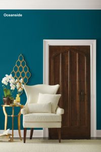
Sherwin Williams describes Oceanside is described by as a complex, deep color that offers a sense of the familiar with a hint of the unknown, Oceanside, bridges together a harmonious balance of blues and greens that can be found in what’s old and new.
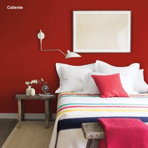
Benjamin Moore: Caliente.
Benjamin Moore: Caliente: Caliente means “hot” in Spanish, and that’s what you get with this color! It’s a deep red shade which immediately draws you into any room. “Caliente is the signature color of a modern architectural masterpiece; a lush carpet rolled out for a grand arrival; the assured backdrop for a book-lined library; a powerful first impression on a glossy front door. The eye can’t help but follow its bold strokes. Harness the vitality.” states Ellen O’Neill, Benjamin Moore & Co.
Glidden’s Deep Onyx (00NN 07/000):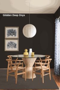
PPG’s signature paint brand, Glidden, selected Deep Onyx , a no-fuss shade of black, as its 2018 Color of the Year. Misty Yeomans, PPG color marketing manager at Glidden paints, explains their choice: “Black can be overlooked as a neutral color, but it works well on an accent wall or as an alternative to white paint on doors, trim and cabinets. The sense of ease and authenticity it brings to a home can’t be denied. Just like a little black dress, Deep Onyx is a classic, timeless staple.”
If you’re ready to try any of these or any other color, we are happy to provide a free, no-obligation estimate. Please contact our offices to schedule a consultation.

Mike Katounas is the owner of Home Works Painting, a painting business in Northern Virginia. He has over 15 years of experience in residential interior and exterior painting, drywall installation/repair, carpentry, wallpaper removal, power washing, commercial painting, color consultation, and staining/sealing. Their service areas include Chantilly, Fairfax, Herndon, Oakton, Reston. Mike takes pride in his work, and he always follows a strict code of conduct that includes the use of quality paint, a clean workspace, and an honest, respectful approach to his customers.